
As Creatives, we spend hours and days (tbh months) creating a portfolio website. It all starts with the search for a template that nobody has used before, the impeccable Home/About/Contact that will set the trend, the ever-evolving Bio telling your +10 years of experience in a sentence, and naturally: the content. Pick 5 or 6 award-winning projects with beautiful visuals, high-resolution pics and the case study, oh yeah! [that goes before anything else. GIFs and mood boards will have to wait]. After adding all the content, we review it again and ask colleagues for their feedback, we refine details and edit mercilessly, keeping the long explanations for a long coffee.
Ironically, we all end up with the same layout: name in bold typography and 6 squares below showing the work. “Unique!?” Mmm the content is what makes the difference, right? – we tell ourselves.
Eventually, the portfolio is ready. Job done! Clap clap! However we must keep updating it as it needs to show the most recent work and personal projects because people don’t want to see your work nowadays, they want to see what you do outside your 9-5. Really? Never-ending story (Ah) 🎶 🎶
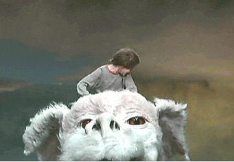
Anyway, one of the most creative and memorable portfolios I’ve discovered is Rachel Denti’s site. It’s so simple and engaging. You don’t need any of the things I mentioned above, you just need to feed a pigeon.

