One of my favourite things after Christmas is finding leftovers in the fridge. The joy of not cooking plus finding a seasonal set menu for a week is wonderful.
Supposedly January is about dieting, but not in this house. Every night when I check the cupboards looking for something to eat, I keep finding hamper bits from Harvey Nichols and they are simply beautiful. You can tell they dedicated time and talent to it.
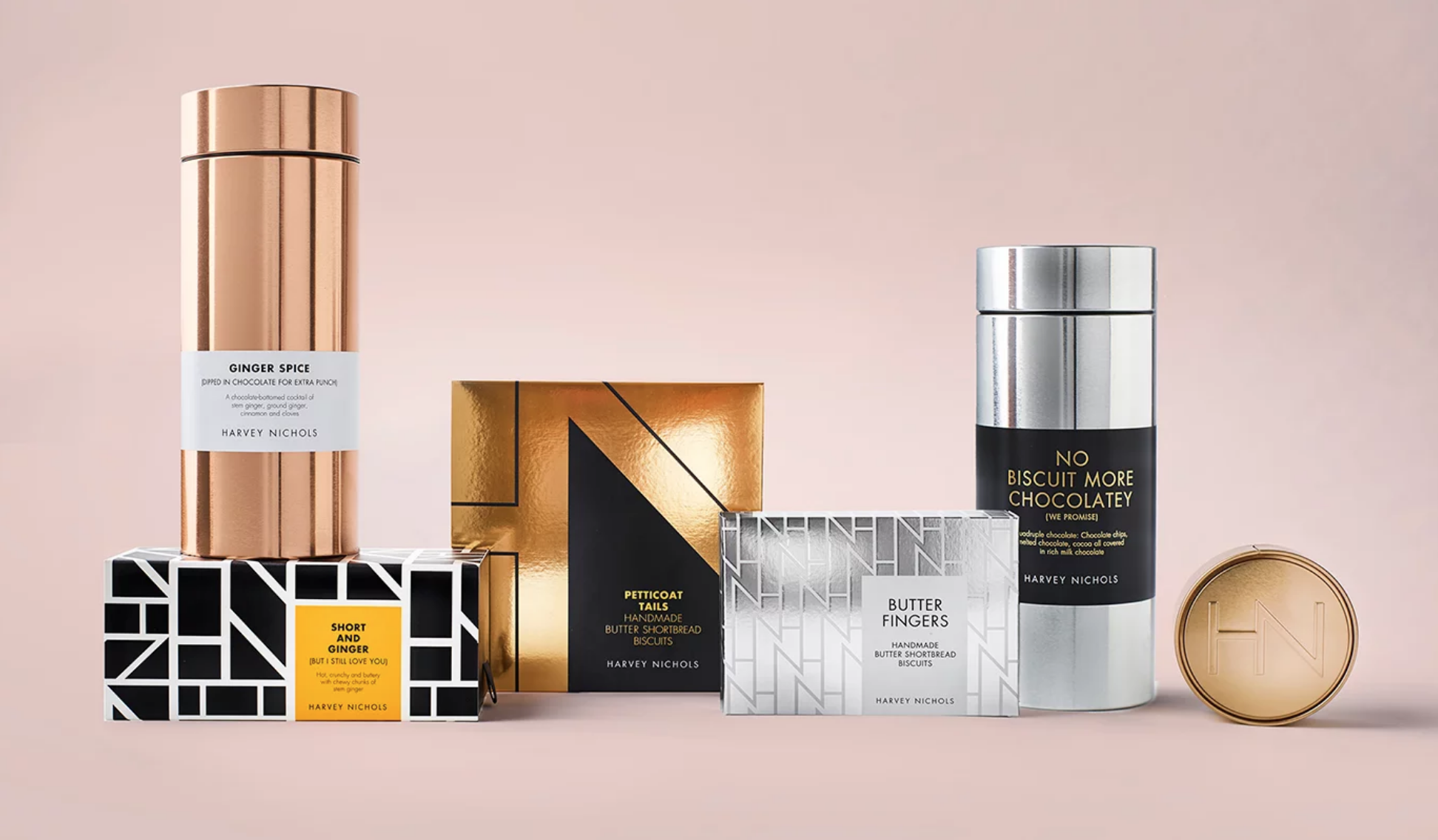
It sounds like someone is paying me for writing this, but no, not yet. I just want to share my love for their design, literally when food met fashion. Harvey Nichols’ own-label food packaging launched in 1994 and it became famous for its iconic monochrome and photography. Last year, Smith and Village revamped the collection -fearlessly stylish- and every single item has been beautifully presented and conceptualized. Hats off to the artists.
“The design of the physical packaging has been extremely important in this project. For a start, none of it is throw-away, so the Harvey Nics brand lives on in people’s kitchens long after the product is finished. Secondly, it is led and inspired by fashion to delight the target audience – pull-out biscuit packaging that is closer to a sunglasses case than a pack of biscuits; airtight tins to keep biscuits fresh for longer with colors inspired by lipstick shades and shiny, elegant refillable tea tins,” adds Debrah Smith, Creative Director, Smith&+Village.